17.5.2024 - 16.6.2024 || Week 4 - Week 8
Yong Zhen Xing || 0359473
Typography || Bachelor of Design (Honours) in Creative Media / Taylor's University
Task 2 | Key Artwork & Collateral
Contents
1. Lectures
2. Instructions
Task 2A : Key Artwork
Idea 1
Idea 2
Adding Colours
Wordmark Animation
Final Outcome
Task 2B : Collateral
Initial Layout Design
Layout & Design Revision
Final Outcome
3. Feedback
4. Reflection
5. Further Reading
LECTURESAll Online Lecture Notes
Week 5 :
Online Class
This week was a public holiday, however we still had a short class session to check up on our work.
Week 6 :
Physical Class
For this class, we first had a feedback session about our final key artwork. Then we were given time to complete whatever was necessary in our artwork. Soon, we needed to print out the key artwork to see if it was distinguishable when viewing it in a big or small size.
Week 7 :
Online Class
Because of unforeseeable class environment, this class was conducted online. In this class, we first had a feedback session regarding our Instagram layout. Then Mr.Vinod shared some work such as Reddit's brand transformation to give us a better understanding on how to expand on our wordmarks. Lastly, he briefed us on the final task 3, Type Exploration & Application.
INSTRUCTIONS
Task 2A : Key Artwork
In this task, we needed to create an artwork with our name, or more specifically a wordmark. We had to use our first name or pseudonym to come up with artwork that represents ourselves. It also needed to be done elegantly with nothing too complicated or confusing. Then we needed to test the wordmark with a chosen colour palette to see if the colour works with the wordmark. Lastly, we needed to create a simple animation about the wordmark.
Idea 1
Firstly, I made a mind map about myself. I wasn't quite sure what things to write about myself, so I looked into a few different aspects and talked about those.
fig 1.1, Mindmap About Myself (21/5/2024)
With the idea from the mind map, I then begin doing sketches. I tried focusing on a blocky theme for simplistic, cozy for my favourite aesthetic and maze for sometimes being stuck.
fig 1.2, Sketch 1 (21/5/2024)
Outcome 1
Then after sketching, I imported and started digitalizing in Illustrator. I went for my second and third sketch because It looked the most interesting to me. I also readjusted the first one so it was more balanced.
fig 1.3, Outcome 1 (21/5/2024)
Feedback 1
After receiving feedback from Mr.Vinod, he told me that I needed to explore more. He also said that it should reflect on something positive about myself.
Idea 2
I was really blanked out at this point because I lacked ideas and didn't know how to make my name look somewhat interesting. So I started looking up some reference of wordmark in pinterest. While there were many interesting looking ones. I unfortunately still didn't know how to proceed with my name. So what I did first was list out all of my positive aspects, then I decided to time myself 20 minutes to come up with many ideas as I can within that time frame.
Afterwards, I select some of the interesting ones and develop it even further. Some were even combined together. From here, I chose 3 of the most interesting sketches and import them to illustrator.
fig 1.4, Sketch 2 (28/5/2024)
Outcome 2
Below shows the outcome of the selected artwork with its own description.
fig 1.5, Outcome 2 (28/5/2024)
Feedback 2
After receiving feedback from Mr.Vinod again, he found my third artwork with the most potential. He said I needed to first readjust my border thickness and spacing between that and the letters. Next, my 'N' looked like 2 different letters so that needs to addressed too. The image below shows how it looks like after those fixes.
fig 1.6, Border and letter 'N' fix (1/6/2024)
Then I needed to readjust my sharp edges on 'Y' and 'N' to be more curve too as it doesn't match with my other letters. The image below shows the before and after for that curve fix.
fig 1.7, Before and After Revision (1/6/2024)
Below shows the artwork in different sizes to see if the wordmark would still be distinguishable when the size is reduced.
fig 1.7, My Artwork Size Comparison (1/6/2024)
So what does the wordmark mean/represent ?
Experiment
I always like to experiment different types of design and in this case I attempted a more abstract approach than something I normally do.
Cozy
I always love being in a comfortable environment and to represent that, I made the type very rounded and smooth. The border around the wordmark also represents coziness in a sense as the letters are always in this enclosed space of familiarity.
Flexible
I like to think that I am very flexible when it comes to fitting things in my schedule so I wanted to represent that by mirroring all of the letters in the word. As shown, it is still readable.
Other Elements
The dot in the center represents a person, more specifically me always wanting to experiment and explore different paths. All the letters can also be seen facing the dot with the letter 'O' being incomplete. This is to show many different paths are open and waiting to be explored.
Adding Colours
Next, I needed to now decide on a colour for the wordmark. I have no idea where I could even begin with a colour palette, so I decided to use a website called Colour Hunt and experiment with different colour palettes in the website (shown in fig 1.8). I decided to experiment each wordmark with 3 different colour combinations too as I think it's what makes it look interesting.
fig 1.8, Colour Palette Testing (4/6/2024)
While there were many interesting colour combinations, I think the last one was perfect for my artwork as it has the feeling of one of my keywords and that is coziness.
fig 1.9, Chosen Colour Palette (4/6/2024)
When I showed Mr.Vinod my Instagram layout, he pointed out that I should add an off-white as a neutral shade and so I did. Since the submission required a specific 2 colour tests, fig 1.10 shows exactly that.
fig 1.10, Dual Colour Testing (8/6/2024)
Wordmark Animation
When it comes to animation, I used Aftereffects because it made animating much easier. I also chose my main wordmark colour for the animation.
For the idea of the animation, I wanted a simple bounce effect followed by a rotating zoom in and out to highlight my keyword "Flexibility".
fig 1.11, Animating Process Using After Effects (20/6/2024)
Below shows the first version of the animation. While my idea was there, the animation didn't ended up as clean as I wanted. The rotation wasn't properly aligned with the center and the bounce effect I attempted felt a bit too much.
fig 1.12, Wordmark Animation First Attempt (20/6/2024)
In my second attempt, I reduced the bounce as well and aligned the rotation better. The rotation also now goes both clockwise and counter clockwise for a smoother effect. Lastly I added motion blur to make the animation feel smooth. I love how it turned out!
fig 1.13, Wordmark Animation Revision (20/6/2024)
Final Outcome
fig 1.14, Final Key Artwork - Black on White (8/6/2024)
fig 1.15, Final Key Artwork - White on Black (8/6/2024)
fig 1.16, Final Key Artwork Colour Palette (8/6/2024)
fig 1.17, Final Key Artwork - Coloured on Lightest Shade (8/6/2024)
fig 1.18, Final Key Artwork - Lightest Shade on Darkest Shade (8/6/2024)
fig 1.19, Final Wordmark Animation (20/6/2024)
fig 1.20, Final Key Artwork [PDF] (8/6/2024)
Task 2B : Collateral
In this next task, we need to utilize the wordmark in task 2A and create an Instagram page that promotes our identity as a brand as well as collateral that we will create. We needed to create 3 collateral and expand our wordmark through patterns, keyword used, images and the mark itself. These designs would then be put up on Instagram as an "Instagram Puzzle" to promote our brand.
Initial Layout Design
The Instagram Puzzle will have 9 panels and the rough plan of each panels are :
Panel 1-3 : Pattern Design, Colour Palette, Pattern Design
Panel 2-6 : Wordmark, Photo of Designer, Wordmark
Panel 7-9 : Collateral 1, Collateral 2, Collateral 3
For my collateral, I have selected T-Shirt, Notebook and Water Bottle. I chose 3 of this items as for my branding as it represents my aesthetic and keyword, coziness. Which means being in a place of comfort and zen.
Firstly, I took a photo of myself to be used in one of the 9 panels. Then I added my key artwork on top without the borders. I went for a symmetrical balance as I thought it will look straightforward.
fig 2.1, Photo of Myself with Added Workmark (4/6/2024)
Then, I created this simple pattern design using my main letter 'Y' and the dot as the structure.
fig 2.2, Pattern 1 Panel (4/6/2024)
My next pattern involves repetition of the letter 'Y' to create fig 2.3. Dot were also implemented in between each of the connecting 'Y' to give it a more interesting look.
fig 2.3, Pattern 2 Panel (4/6/2024)
For the 3 collateral, I utilize mainly my key artwork alongside my 2 different patterns I created. From left to right, fig 2.4 shows my design for the T-Shirt, Notebook and Water Bottle. I then used Mockey to implement the design on the collateral.
fig 2.4, Initial Collateral Design (4/6/2024)
Below shows the first attempt of the Instagram layout.
fig 2.5, Instagram Layout first attempt (4/6/2024)
Feedback
After receiving feedback from Mr.Vinod, some key points he pointed out are :
- The expression of myself should be more presentable.
- Don't overuse pattern in a design, instead consider other
elements such as words based around the design, mark and images.
- The
design is stale as a result of reusing the same patterns.
- Don't have
elements in the background of your collateral as it ruins it.
Layout & Design Revision
After receiving those feedback, I then went reworking on most of my panels. The first thing I did was took a better photo of myself. I then implemented interplay to my panel through layering.
fig 2.6, Photo of Myself with Added Workmark Revision (11/6/2024)
Next, I decided instead of using my key artwork over and over again, I want to make a logo to represent my brand. This helps by providing my brand with a more simple and recognizable identity.
fig 2.7, Wordmark Simplified [Logo] (11/6/2024)
I also decided to use the same logo in fig 2.7 as my Instagram profile picture. Since Instagram uses a circular image to display user's profile picture, I decided to make the border circular as well so that it would look natural. fig 2.8, Instagram Profile Picture (11/6/2024)
I decided to discard the pattern I made in fig 2.2 and instead work on highlighting my 3 key points of my wordmark. The 'Y' with the dot can be seen highlighted according to my logo. The word 'Experiment' being 2 separate parts to look different and 'Cozy' and 'Flexible' are inside an enclosed box to show coziness while the word 'Flexible' has its 'E' mirrored to show flexibility on reading.
fig 2.9, Word Panel (18/6/2024)
Below shows my process of me implementing my designs in a mockup. This time, I used Unblast with a combination of Photoshop instead as it allows more customization.
fig 2.10, Implementing Design in a Mockup using Photoshop (18/6/2024)
Fig 2.11 shows a failed water bottle collateral. The reason I didn't end up using this was because my bright colour palette made the lighting of the bottle a bit unrealistic. I then had to choose different mockup.
fig 2.11, Failed Water Bottle Collateral (18/6/2024)
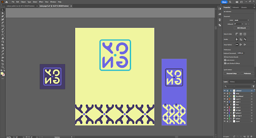
Below shows my work file process for designing the 3 different collateral. I also had to match the artboard to the canvas size in the mockup so that it would align perfectly when I import to Photoshop.
fig 2.12, Collateral Designing (18/6/2024)
The images below shows the revised Instagram layout as well as my Instagram page with all of my designs. I am quite happy how it turned out in the end!
fig 2.13, Revised Instagram Layout Design (18/6/2024)
fig 2.14, My Instagram Page (18/6/2024)
Final Outcome
fig 2.15, Final Collateral 1 - T-Shirt (18/6/2024)
fig 2.16, Final Collateral 2 - Notebook (18/6/2024)
fig 2.17, Final Collateral 3 - Water Bottle (18/6/2024)
fig 2.18, My Instagram Page Screenshot (18/6/2024)
fig 2.19, Final Task 2B [PDF] (18/6/2024)
FEEDBACKWeek 5
Key Artwork :General Feedback : Take account into white space (by drawing a box around) so that parts of the artwork isn't too powerful. Make sure readability is another key factor to your artwork. Ask yourself if you would buy the artwork on a t-shirt, think originality. Make sure the key artwork reflects on who you are and not because you like something. Consistency in the letters especially the thickness, should be consistent. Don't rely too much on graphic element and make sure that the idea you come up with, gives the same impression to other people.
Specific Feedback : Needs more exploration. While the type might reflect on who you are, make sure it is the positive aspects on yourself.
Week 6
Key Artwork :
General Feedback :You should always be careful when using thin strokes because when it is scaled down, it becomes hardly visible.
Specific Feedback : Instead of choosing explorative for my keyword, I could for for experimentative. For my border of the word mark, I could made the thickness the same or half of the letters I made. Even spacing between border and the letters are also important. I should also curve my letter 'Y' and 'N' to match better with my style of font. I should also always rationalize my decisions.
Week 7 :
Collateral :
General Feedback : Don't utilize the same pattern for the design and don't use light colour schemes. When designing the 9 tiles, don't repeat the same identity as it makes it look cheap. When designing the collateral, ensure that it has a mix of patterns made as well as the identity itself. Don't make it a standalone thing.
Specific Feedback : Colour schemes are acceptable but consider adding another neutral shade such as off-white. The expression of myself should be more presentable. Pattern is fine but don't overuse it in a design, instead consider other elements such as words based around the design, mark and images. The design is stale as a result of reusing the same patterns. Don't have elements in the background of your collateral as it ruins it.
REFLECTION
Experience
When doing these 2 task, I had a fun time trying to express my wordmark into a collateral. This task definitely felt more special than the rest as it's designing our identity and trying to market our brand through collaterals. While I did struggle at first trying to come up with an idea for my brand, I ended up liking how it turned out! The collateral was also really fun to make as I play a game with myself called "Would I buy it or not!". My first version in terms of design was definitely weak, but I ended up making a revision that I feel really suites my identity! These 2 tasks were definitely by far the most fun I had in designing something!
Observation
While looking at past students' work, I have noticed that some students played around or sometimes maintain a certain colour for their colour palette. Some student chose a simple colour palette while others choose something with more variety which makes it look interesting but also unpleasant to look it. It made me realize how important the colours selected were and so when choosing my own colour scheme, I had to ensure the colour I choose isn't too complex or too much for the eyes. Another thing I noticed from past students' work is that most of them took a very simplistic approach yet have creative designs when it comes to designing each panels and collateral. I took note of this and try not to come up with complex designs when I work on my collateral.
Findings
These 2 tasks is about expanding your identity to form a unique brand of ourselves. Throughout this task, I have learned that it is always important to explore in-depth about what is it that I want to do and not think in a limited matter. I have learned that forcing myself to come up ideas in a short period of time allows me to think of many different design possibilities that I could expand on. Exploring different ideas then allows for more different decisions that I could make.
FURTHER READING

fig 3.1, The Vignelli Canon
I chose this book as it seemed like an interesting book about the author's way of how they go about when it comes to designing. The author also add that through this book he hopes that the knowledge passed down would improve design skills for the reader.
fig 3.2, Semantics, Syntactic and Pragmatic
There are 3 aspects in design that are important to the author ; Semantic, Syntactic and Pragmatic. Semantic in design mean to understand the subject in all its aspects ; to ensure that the subject for the sender and receiver makes sense on both ends. For the next aspect, syntactic, it refers to creating consistency in a design. For instance, how a type could relate to grids and images throughout the design. Pragmatic on the other hand refers to handling things sensibly in a more practical way. A design should stand by itself in all its clarity, but at the same time makes sense without a need for explanation.


Comments
Post a Comment