Typography | Task 1 : Exercises
Yong Zhen Xing / 0359473
Typography / Bachelor of Design (Honours) in Creative Media / Taylor's University
Task 1 | Exercises
Contents
1. Lectures
2. Instructions
2.1 Sketching
2.2 Digital Exploration
2.3 Type Expression Animation
Final Outcome 1
2.4 Tracking And Kerning
2.5 Layout Design
Final Outcome 2
3. Feedback
4. Reflection
5. Further Reading
LECTURES
Week 1 :
Physical Class
For our first class, we were briefed us on key points such as rules & advices, the module information booklet and things needed to get us started. Soon we were to start our e-portfolio using a site called blogger. We then followed a video on making the e-portfolio. The video which was made by Mr.Vinod himself thought about the format, making of a section, uploading a file and also uploading and verifying whether the blog was updated or not. It was overall a very helpful video!
Online Lectures
Typo_0_Introduction
- Learning about the Importance of typography in our everyday life
- Calligraphy - Writing styles ; Lettering - Drawing the circumference of the letter
- Typography means an art and technique of arranging type to make written language legible, readable and appealing.
- Fonts refers to a individual font while typefaces refers to an entire family of fonts.
An example of how they look are shown below
Font : Times New Roman, Times New Roman Italic, Times New Roman Bold.
Typeface : Arial, Georgia, Courier.
Typo_1_Development
Development / Timeline
- Phoenicians wrote from right to left.
- Greek developed 'boustrophedon' a style of writing which lines of text read alternately from right to left and left to right.
- Etruscan (and then Roman) paint letterforms before inscribing it.fig 1.2, The evolution of the letter 'A'
- Square capitals are letterforms that have serifs added to the finish of the main strokes.
fig 1.3, Square Capitals - Rustic Capitals are a compressed version on square capitals. It took less time to write but were slightly harder to read.fig 1.4, Rustic Capitals
- Roman cursive were used for everyday transactions and generally for speed. This was the beginning of lowercase letterforms.fig 1.5, Roman cursive
- Uncials are lowercase and uppercase combined.fig 1.6, Uncials
- Half-uncials are formal beginning of lowercase letterforms.fig 1.7, Half-uncials
- Charlemagne introduced uppercase and lowercase letters, capitalization and also punctuation which allows for a more standard writing system and a more accurate way to convey messages.
- Different places in Europe found their own letterforms to their liking.
- Gutenberg with his engineering, metalsmithing and chemistry skills made a machine where documentation of information is much more efficient.fig 1.8, Gutenberg's Bible
Week 2 :
Physical Class
In this class, Mr.Vinod checks our progress from week 1. He went through a couple of our e-portfolios (mine included) and gives us his critical feedback. He also asks us to submit our sketches through the Facebook group in which he gives more feedback and some more past's students' examples. Then we were to watch 2 videos of his teaching about Adobe Illustrator. We were then immediately start on digitizing our sketches, but unfortunately we still haven't gotten our access to Adobe Creative Cloud yet. So we couldn't do much but to wait for it.
Online Lectures
Typo_3_Text_P1
Tracking : Kerning and Letterspacing
Kerning : Automatic adjustment of space between letters
Letterspacing : Adding space in between the letters
Tracking : The addition and removal of space in a word
Tracking can be split into 3 ; Normal Tracking, Tight Tracking , Loose Tracking.
Using letterspacing in uppercase letterforms are generally accepted as it plays a role to stand out. However, that can't be said for lowercase letterforms as it needs to maintain readability.
Formatting Text
Flush left : Just like writing, each line starts at the same point but end whenever the last word on the line ends.
Centered : This format forces symmetry on the text, every line will be assigned as equal value and weight.
Different typefaces suit different messages. Consider texture in typefaces too. For instance, a type with a generous x-height or relatively heavy stroke width produces a darker mass on the page than a type with a relatively smaller x-height or lighter stroke. Sensitivity to these differences in colour is the key to create successful layouts.
Type size : Large enough to be easily read from at arms length .
Leading : Text that is set tightly encourages vertical eye movement where a reader can easily loose his/her place. Type that is set loosely creates striped patterns that distracts the reader from the material at hand.
Line Length : A good rule of thumb is to keep line length between 55-65 characters.
Type Specimen Book
To provide an accurate reference for type, type size, type leading, type line etc.
- Enlarging a type up to 400% on the screen is always adviseable to get a clear sense of relationship between descenders on one line and ascender on the line below.
- Actual prints will always be more accurate unless you're designing for screen which then screen would be more accurate.
Week 3 :
Physical Class
In today's class, we started with the progress check and updates on the e-portfolio. After that we moved on to checking on our 4 artwork with our chosen words. There were many design from my classmates which I found very interesting and give me a bit of inspiration. Mr.Vinod also commented on my work where I have to do a few changes. After that, we watched a short video by him on how to animate our words in Illustrator. He gave us time and then he showed some of our drafts to the entire class. He also touched on dos and don'ts when making ideating and executing the animation.
Online Lectures
Typo_3_Text_P2
Indicating Paragraphs
- Pilcrow (¶) was used to use paragraph spacing but it's seldom used today.
- To ensure cross-alignment, the paragraph space should be the same as the line space.
- Typically the indent is the same size of the line spacing or point size of the text.
fig 3.4, Usage of indent
- Extended paragraph below creates unusually wide columns of text, however with that being said there still could be reason for that choice.
Widow : Short line of type left alone at the end of a column of text.
Orphan : Short line of type left alone at the start of new column.
Orphans however require more care and careful typographers make sure that no column of text starts with the last line of the preceding paragraph.
In some cases texts needs to be highlighted, however different kinds of emphasis require different kinds of contrast. Some ways of highlighting would be making it Italic, bolding, using a different typefaces or even just highlighting it through colour changes (black, cyan, magenta).
when highlighting text through adding colours at the back, maintaining the left reading axis ensures readability is at its best.
There are variety of subdivision within text of a chapter and it is a must for typographers to know which text is the most and less important. The image below shows A, B, C where it is labeled based on the level of importance.
Describing Letterforms
Median : The imaginary line defining the x-height of letterforms.
X-height : The height in any typeface of the lowercase 'x'.
Arm : Short strokes off the stem of the letterform, either horizontal (E, F, L) or inclined upward (K, Y).
Bard : The half-serif finish on some curved stroke.
Bowl : The rounded form that describes a counter. The bowl may either be open or close.
Cross Bar : The horizontal stroke in a letterform that joins two stems together.
Cross Stoke : The horizontal stroke in a letterform that joins two stems together.
Crotch : The interior space where two strokes meet.
Descender : The portion of the stem of a lowercase letterform that projects below the baseline.
Ear : The stoke extending out from the main stem or body of the letterform.
Em/en : Originally refering to the width of an uppercase M, and em is now the distance equal to the size of the typeface. An en is half the size of an em. Most often used to describe em/en spaces and em/en dashes.
Finial : Finial The rounded non-serif terminal to a stroke.
Leg : Leg Short stroke off the stem of the letterform, either at the bottom of the stroke (L) or inclined downward (K, R).
Ligature : The character formed by the combination of two or more letterforms.
Link : The Stoke that connects the bowl and the loop of a lowercase G.
Loop : In some typefaces, the bowl created in the descender of the lowercase G.
Shoulder : The curved stokre that is not part of a bowl.
Spine : The curved stem of the S.
Spur : The extension that articulates the junction of the curved and rectilinear stroke.
Stem : The significant vertical or oblique stroke.
Stress : The orientation of the letterform, indicated by the thin stroke in round forms.
Swash : The flourish that extends the stroke of the letterform (Never use captical forms of swash together).
Tail : The curvede diagonal stroke at the finish of certain letterfroms.
Terminal : The self-contained finish of a stroke without the serif.
Uppercase : A B C D E F
Lowercase : a b c d e f
Small Capitals : Draws to the x-height of the typeface. Primarily found in serif fonts as part of what is often called expert set.
Uppercase Numerals : Same height as uppercase letters and are all set to the same kerning width. Best used with tabular mmaterial/situation that calls for uppercase letters.
Lowercase Numerals : Set to x-height with ascenders and descenders. Best used when you would use upper and lowercase letterforms.
Italics : Most fonts today are produced with matching italic. Small caps, however are almost always only roman and refer back to 15th centry Italian cursive handwriting.
Punctuation, miscellaneous characters : All fonts contain it but changes from typeface to typeface. Therefore typographers should be acquainted before using the appropriate type for a particular job.
Ornaments : Used as flourished in invitations or certificates. Usually provided in larger typeface family.
Roman - Derived from inscriptions of Roman monuments. A slightly ligeter stroke in roman is known as 'Book'.
Italic - Named for 15th Century Italian handwriting on which forms are based. Oblique conversely are based on roman form of typeface.
Boldface - Characterized by a thicker stroke than a roman form. Depending on the stroke widths within the type face, it can also be called 'semibold', 'medium', 'black', 'extra bold', or super. In some typefaces (notably Bodoni), the boldest rendition of the typeface is referred to as 'Poster'.
Condense - A version of the roman form, and extremely condense styles are often called 'compressed'.
Extended - An extended variation of a roman font.
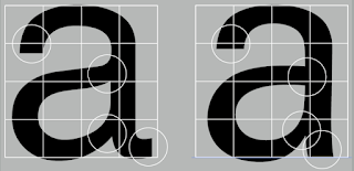
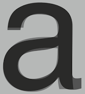
Beyond the gross differences in x-height, the forms display a wealth of variety, in line weight, relative stroke widths and in feeling. For typographers, these feelings connote specific use and expression. The image below is a great way to show the variety alongside the range of attitudes for the letter 'a' and 'R'. This examinations tells you how you feel about type and specific typeface. It allows you to bring to a discussion of appropriate type choices in works.
The uppercase letterforms suggest symmetry but it's not. As shown below, each bracket connecting the serif to the stem has a unique arc.
Even typefaces like Univers are not symmetrical (In this case the width of the left slope is thinner). This shows the meticulous care a type designer takes a create letterforms that are internally harmonious and individually expressive.
Letters / Form / Counterform
A close-up examination provide a good feel for how to balance between form and counter is achieved and also a sense of letterform's unique characteristics. The shape of the 's' holds itself while the 'g' loosese its identity. This is because each elements are to be examined without the context of the letterform.
The following are some examples of contrast which is the most powerful dynamic in design.
Typography exists not only on paper but on a multitude of screens. That includes operating system, system fonts, the device and screen itself,the viewport and more. Typography today changes based on how the page is rendered, because typesetting happens in the browser.
Print Type Vs Screen Type
A good typeface for print : Calson, Garamond, Baskerville are the most common typefaces used for prints because its highly readable when set at small font size. They are versatile, easy-to-digest classic typeface makes typesetting with it a breeze.
Type for Screen
Typefaces intended for use on the web are optimized are often modified to enhance readability and performance onscreen in a variety of digital environment. This can include a taller x-height (or reduced ascenders/descenders), wider letterforms, more open counters, heavier thin strokes and serifs, reduced stroke contrast as well as modified curves and angles for some designs. More open spacing is another important adjustment for typefaces of smaller sizes. All these factors serve to improve overall readability and character recognition for type for screen.
Hyperactive Link / hyperlink
A hyperlink is a word/phrase/image that you can click on to jump to a new document/section within the current document. Hyperlinks are found in most web pages, allowing users to click their way from a page to another. Text hyperlinks are also usually blue and underlined by default. When moving the cursor over a hyperlink, whether it is text or an image, the arrow should change to a small hand pointing at the link.
Font Size for screen
16-pixel text on a screen is about the same size as text printed in a book/magazine. We read books pretty close (often a few inches away) so they are typically set at about 10 points. If you were to read from an arm's length, you would want at least 12 points which is close to 16 pixels on most screens.
Each device comes with its own pre-installed font selection based on its operating system. However each differs by a little. Windows-based devices might have one group while MacOS have another. Google's own android system uses their own as well.
Some designer tend to use a different font for their site, but if it's not installed or not pulling from a web-friendly place, it will default to some basic variation like Times New Roman which some visitor may find ugly.
'Web safe' ones however, appear across all operating platforms.
System Fonts for Screen / Web Safe Fonts
Open Sans, Lato, Arial, Helvetica, Times New Roman, Times, Courier New, Courier, Verdana, Georgia, Palatino, Garamond
Screens on PCs, tablet, phones and TVs differ in sizes and therefore text on-screen proportion are different too. Because they have differnet sized pixels. 100 pixels on a laptop is very different from 100 pixels on a 60" HDTV
Static Vs Motion
Static Typography
Whether they are informational or promotional, the level of impression and impact they leave on the audience is closely knitted to their emotional connection with the viewers.
Motion Typography
Temporal media offer typographers opportunities to “dramatize” type, for letterforms to become “fluid” and “kinetic” (Woolman and Bellantoni, 1999). Film title credits present typographic information over time, often bringing it to life through animation. Motion graphics, particularly the brand identities of film and television production companies, increasingly contain animated type.
fig 6.10, Rhythmic Fast Kinetic Typography- Don't Blink by PiXeL ARTWORKS
INSTRUCTIONS
Task 1: Exercises - Type Expression
Sketching
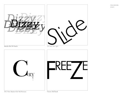
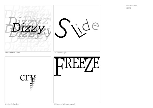
Our first exercise consists of sketching out a couple of type expression sketches with the 4 words of choice that was voted on. These words are Dizzy, Electric, Fire, Cry, Gun, Slide,Freeze and we were to based it on the 10 fonts we were given without deviating too much from the fonts. Below are my sketches with the chosen words : Dizzy, Slide, Cry and Freeze.
Digital Exploration
Cry : I swapped the current cry to one of my other exploration ones.
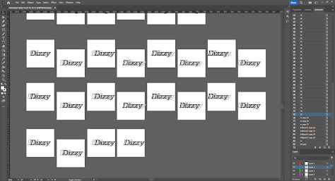
After doing the artwork, we were to animate the word to show its expression. I decided to go for "Dizzy" since I already had a rough idea on how to animate it. The basic idea was to make the word constantly hitting back and forward while picking up speed to create a sense of a dizzy / head spinning effect. The word would then be hitting the wall one last time before spitting out dizzy everywhere. The picture below shows the first progress of animating with the word by planning it roughly first. This is split into 4 sections where each section will be divided to make animating later easier (it will be more clear later).
So, what did I do? I decided to redo each frame again making sure each word has the same size. Image below shows the replanning of the animation with the animated part for the last section.
This was the results of the animation so far.
After importing all the frames to Photoshop, it was just the matter of adjusting timing to ensure that the GIF fades out enough to see the end and the final crash before the last part is noticeable by slowing it down.
After another feedback session from Mr.Vinod, I was told that the change to the Dizzy spreading out is a bit unnecessary. So I removed the ending while making it slightly longer as shown below.
Task 1: Exercise 2 - Text Formatting
Exercise A :
In this exercise, we watched a video which teaches the basics of Adobe InDesign. We then were to put our names with 10 different typefaces we are going to be using and format it as the per image below.
The main goal of this exercise were to practise on tracking and kerning. Which is what the image below shows. I wish there was an easier way to compare lengths of certain letters but nevertheless I tried the best within my abilities to make it even as possible.
Layout Design
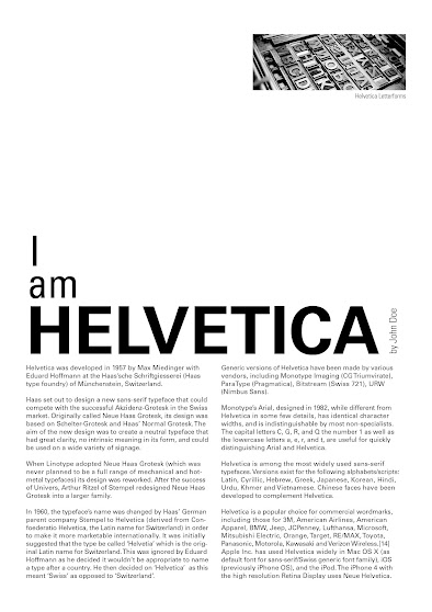
After learning about the basics of Tracking and Kerning, we were to now apply it in a page layout. First, I followed the tutorial to learn more about InDesign and what is the expected outcome for the exercise. The image below shows an attempt after following the tutorial.
Then I came up with a couple of layout designs to see which would look the best. I also tried to keep it as simple as possible as simplicity is always pleasant to the eye. Below are my exploration on layout designs.
After exploring different layouts, I have decided my 3rd exploration for my final work. There were some things needing tweaking such as some kerning and kerning, the image size/choice and also some small adjustments.
Final Outcome
HEAD
Font/s: Univers LT Std
Type Size/s: 91 pt
Leading: 88
Paragraph spacing: 0
BODY
Font/s: Univers LT Std
Type Size/s: 9 pt
Leading: 11 pt
Paragraph spacing: 11 pt
Characters per-line: 60
Alignment: Allign Left
Columns: 2
Gutter: 5 mm
FEEDBACK
Week 1
Exercises :
General Feedback : Ensure the word sketches don't have much distortion and essentially try to explore many sketches and ideas.
E-Portfolio :
General Feedback : Use past students' example to get a bit of reference on the format. When the blog is updated, use a private tab to check back our site to ensure the update has been applied and also the way we want it to be.
Week 2
Exercises :
General Feedback : Make sure any added added visuals isn't too strong or it will defeat the purpose of the task.
Specific Feedback : Be confident with ourselves and take risks when it comes to making a creative work. Also be brave into evaluating our own work as design or art in general is subjective to everyone.
E-Portfolio :
Specific Feedback : No problems with the label. Add "Task 1 | Exercise" on the top. Also make the sketches image more brighter. Begin watching and taking notes on video 01.
Week 3
Exercises :
Specific Feedback : For my "dizzy" artwork, I needed to add more light shades of the word to fill up the space. For my "slide" artwork, I needed to make it so that that the letter 'S' and 'L' isn't combined so that it looks more readable. For my "cry" artwork, I needed to make it less abstract because it lacks what the word truly means. For my "freeze" artwork, it was lacking a proper typeface.
E-Portfolio :
General Feedback : All tasks should have progression and a description.
Specific Feedback : The images for our works should have a date and we are not allowed to link the video of the lecture.
Week 4
Exercises :
Specific Feedback : The animation is overall good but the ending is random and doesn't need to be there.
Week 5
Exercises :
Specific Feedback : Overall good and acceptable layout. But be cautious to not overtighten letterspacing or it will look too compressed and unreadable. In some case cases use hyphen if necessary and good image placement.
General Feedback : It
was a pretty helpful feedback session as I learned a lot of small
mistakes that can happen alongside with learning what layout is a good practice
and what is not.
REFLECTION
Experience
When I first started typography, I didn't really think too much about it. I thought it would just be another design class about arranging letters to fit something but after a few lecture classes, typography was way more in-depth than I initially thought! I started to really appreciate typography not only as a subject but to its entirety such as letters on my keyboard, on the street or even in logos of company. The first task really made me scratch my head when I was sketching as we couldn't distort the letterforms and had stick to a basic font. Coming up with a way to describe words using just the words was quite challenging to be but after a few hours I managed to come up with a couple of ideas. Using illustrator to animate our type expression exercise was also pretty challenging as you can't really see how smooth your animation is or how it will turn out. Only after putting all in photoshop only then you can see your work. Luckily I learned a bit of animation from my last semester which helped me plan out my type expression animation. My text formatting exercise was also pretty interesting as I learn a new software called Indesign which I found pretty friendly to use! I also learned about tracking and kerning alongside with how to avoid mistakes such as ragging. This could be important if I ever want to make a print type work such as a book in the future.
Observation
I start to notice typography everywhere in my daily life and start to observe it to get some form of inspiration for class. Whether it be in games, products, or in malls, I always stare at its typography to see if I could improve anything about it or just admire it as it is. I look at many past student's work to get some inspiration and ultimately ask myself, how do I make mine better? Both in terms of presentation for the blog and also the exercise.
Findings
I learned that using references is quite useful in developing ideas. Another thing I learnt is that sometimes ideas that I think would be good in my head wouldn't be good when executing it on paper. Another thing I learn is to always keep your previous exploration because for the type expression exercise, I decide to use back my other variant of the word "cry" as my current one is too abstract. Feedback sessions happens in every class and I found it really important and helpful for me to take notes on what should and shouldn't be done in our work. I have also learned in the second exercise that there are many consideration that is put into layout design that I never really thought of such as having a certain amount of characters per line so that it doesn't overwhelm a reader.
FURTHER READING
I decided to choose this book from the couple that Mr.Vinod recommend because after flipping through a few pages, this book has more visual which I enjoy more and it teaches what makes for a good typography which I would like to dive more into. We were to read bits a week to enhance our understanding on typography.
I started with the first few pages and learned about the Eight Typographic System where basically teaches different type of typography to make your work looks more interesting. Interesting enough, the reason why we might find these system strange is because we're not used to it which thought me typography is all about exploring different criteria to ensure our works are simple yet interesting, memorable and coherent.
I learned about 3 main subjects this time related to how to guide a reader eyes' for easier reading. This subjects are line breaks, leading, word and letter space. This ensure that the reader have a seemless reading experience without having to go back to a certain point.












Comments
Post a Comment