Information Design | Exercises
03.02.2025 - 18.02.2025 || Week 1 - Week 3
3. Reflection
Exercise 1 - Quantifiable Information
In the first exercise, we needed to take a quantifiable object such as marbles or coins and arranged it a presentable layout/chart. We were recommended to arranged it in a way that tells a story. Before finalizing the layout, we also needed to come out with 4 ways to present the idea.


Arrangement 1 (Top Left) : The Feelings We Have
 fig 1.7, Layout Planning for Story 2 (9/2/2025)
Final Outcome :
 fig 1.8, Final Exercise 1 - Quantifiable Information (9/2/2025)


Next, I started rethinking the main concept/principle of the exercise L.A.T.C.H. I simplified what its definition mean and plan on which one I'll use.
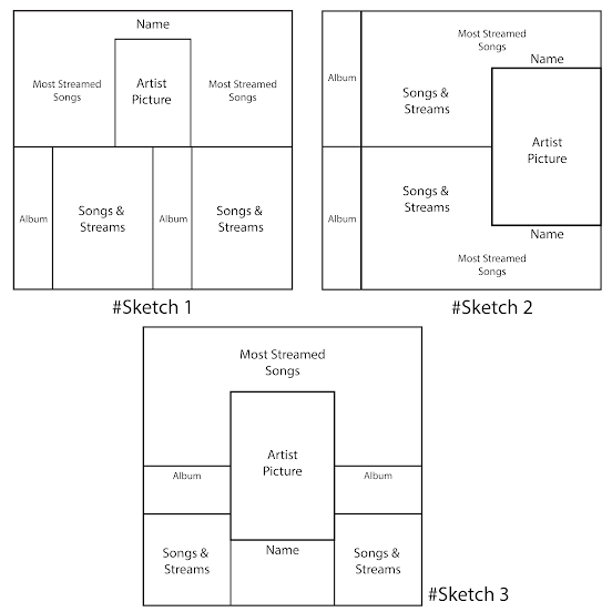 fig 2.5, Layout Planning (14/2/2025)

 fig 2.7, Photo Editing 2 (14/2/2025)
Then, I begin laying out the pictures into my selected layout. I also decided to place the timeline/album release date beside the albums itself as it seemed like the best place to add it. I also ensured that the song's cover art are sorted in alphabetical order. I also used custom fonts for the text.
 fig 2.8, Progression 1 (14/2/2025)
 fig 2.9, Progression 2 (14/2/2025)
 fig 2.10, Progression 3 (14/2/2025)
Final Outcome :
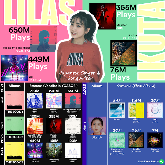 fig 2.11, Lilas Ikuta Song Streams Infographic (14/2/2025)
Yong Zhen Xing || 0359473
Information Design || Bachelor of Design (Honours) in Creative Media / Taylor's University
Exercises
Contents
1. Lectures
2. Instructions
Information Design || Bachelor of Design (Honours) in Creative Media / Taylor's University
Exercises
Contents
1. Lectures
2. Instructions
3. Reflection
Lectures
In the first lecture we learned about the types of infographic. The 8 type of infographics we learned was List, Statistical, How-To, Timeline, Comparison, Map & Location, Flowchart, and Process Description. From all the types of infographic in the lecture, it was eye-opening to see so many different type of infographics shown with each of its importance. I can now see the importance of an infographic in communicating concept/ideas to viewers in a visually appealing format.Lecture 1 - Type Of Infographics
This lecture talks about a theory that I am not familiar with and that is the L.A.T.C.H Theory. This theory allows for information to be organized in a meaningful way especially for UX design. The acronym stands for stands for Location, Alphabet, Time, Category and Hierarchy. Through the examples shown, I have learned this theory can actually be seen commonly in websites which highlights the importance of this theory in helping user navigating a website.
Lecture 2 - L.A.T.C.H Theory
This lecture Talks about Miller's Law of Memory which suggests that our normal human brain can only remember 7 pieces of information or data. Miller also suggests that our sweetspot for remembering is 7, plus or minus two, pass that and we tend to forget.
Lecture 3 - Miller’s Law of Memory
This lecture talks about Manuel Lima's 9 Directive Manifesto which explains on information visualization and why is differs from information art or infographics. From the 9 directive manifesto, I have learned that explanation should always be the center point, having interactivity and citations are important, narrative or story should always be memorable, aesthetics should never be the priority, look for relevant information, manage time efficiently, aspire for knowledge and lastly to simply convey data in a visual form without highlighting the portrayed subject.
Lecture 4 - Manuel Lima’s 9 Directives Manifesto
Lecture 5 - Constructive Workflow
This lecture is more on how to have a solid workflow when doing design-type work. First and foremost is to understand the question without focusing on the answer too much. Next would be to have a solid plan and identify its pros and cons. Then make empty folders and fill them up with any form of progress. Find ideas and inspiration from various source and fill it up. Lastly set your perimeters and let your imaginations run wild. Only time will remain as your constrain.
Back to Top ↑Instructions
Exercise 1 - Quantifiable Information
In the first exercise, we needed to take a quantifiable object such as marbles or coins and arranged it a presentable layout/chart. We were recommended to arranged it in a way that tells a story. Before finalizing the layout, we also needed to come out with 4 ways to present the idea.
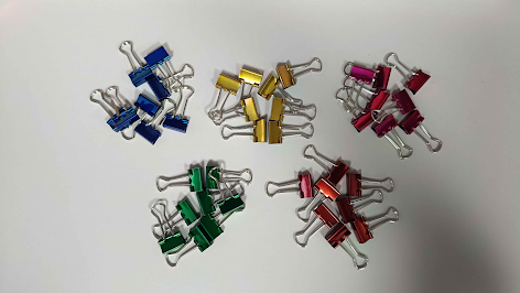
I bought some coloured binder clips for this exercise. First I needed to arranged the data with the following ; Data, Sorted, Arranged, Presented Visually and Explain with a story.

fig 1.1, Data (4/2/2025)

fig 1.2, Sorted (4/2/2025)

fig 1.3, Arranged (4/2/2025)

fig 1.4, Presented Visually (4/2/2025)
Then I made some notes on my data and also experiment on the different state of the binder clips.

fig 1.5, Brainstorm and Notes (4/2/2025)
Then I experimented with different arrangements for my binder clips. While arranging it in a visually appealing way is important, the arrangement also has to tell an interesting story.

fig 1.6, Different Possible Story Arrangement (9/2/2025)
Explanation / Story : Feelings are usually represented by a heart and also colours. These colours are then used to express emotions such as green for neutral, yellow for joyful, pink for love, red for anger and blue for sadness. The outer part of the heart are like the terminals for the electrons trying to absorb other emotions, while the emotions in the air are trying to be attracted to the heart.
Arrangement 2 (Top Right) : Spiraling Out Of Control
Explanation / Story : The title "Spiraling Out Of Control" is a way of going crazy or going insane after a certain incident or feeling depression from life. It's a way of showing that even though we could be strong and stable, a flow could be easily be disrupted causing to feel sadness. The strongest feeling is at the center where calm and happiness are represented by the green and yellow colour, While pink and red represents a slow descent to anger. The last colour blue is to represent acceptance and sadness.
Arrangement 3 (Bottom Left) : Law And Disorder
Explanation / Story : The idea behind this is simply breaking an order of something to break symmetry and pattern. A repetitive pattern could look boring but breaking a rule of something could result in something more interesting and thus make it look more appealing.
Arrangement 4 (Bottom Right) : Having Social Anxiety
Explanation / Story : The story behind this is simply showing how loneliness from not meeting new people. The multiple binder clips on the outer represent different kinds of people that one could potentially meet but unfortunately too afraid to do so.
Next, I did a simple layout planning for the chosen arrangement which is arrangement 2. I chose this arrangement as it looked to most interesting to look it with a rather unfortunate story.


Exercise 2 - L.A.T.C.H
In the next exercise, we need to organize a group of information into a visual poster that contains and utilize the minimum of 4 L.A.T.C.H principles. This needed to be done digitally through photo editing/illustration software with a required outcome of either a 1240 × 1750 or 2048 × 2048 pixels poster. We were allowed to reuse images but we did needed to create the rest of the visuals to complete the poster.
In the next exercise, we need to organize a group of information into a visual poster that contains and utilize the minimum of 4 L.A.T.C.H principles. This needed to be done digitally through photo editing/illustration software with a required outcome of either a 1240 × 1750 or 2048 × 2048 pixels poster. We were allowed to reuse images but we did needed to create the rest of the visuals to complete the poster.
At first, I didn't know what information I should do on about, so I looked at some infographic references in pinterest. While all of the ones I found was quite interesting, the one that stood out to me was the Hatsune Miku one. She is what is known as a vocaloid character or a software voicebank. She is marketed as a virtual idol and has performed in front of a live audience as a hologram projection. While the information of the infographic is lacking, it definitely leans more towards an aesthetically pleasing poster. As she is an idol, it does give me an idea to do an infographic about my favourite artist, Lilas Ikuta. A Japanese singer and songwriter.

fig 2.1, Infographic References (13/2/2025)
Before I start with the design, I first needed to gather information. Since she was a singer and songwriter, I decided to make an infographic about songs that she is widely known for. I also plan on doing her popular songs on 2 different sides, one side is for her own songs and the other is for a pop duo that she sings in. This duo is named "YOASOBI".
First I begin by collecting the total amount of streams from the most popular album in "YOASOBI", THE BOOK 1, THE BOOK 2, THE BOOK 3, as well as from her very first debut studio album, "Sketch". The data will be collected from Spotify was it is a mainstream and popular music streaming platform.

fig 2.2, Collected Stream Data for "THE BOOK 1 to 3" through Spotify (13/2/2025)

fig 2.3, Collected Stream Data for "Sketch" through Spotify (13/2/2025)
As she has only released one complete album, I decided to do a Top 6 for her own music instead of 5.
fig 2.4, English Song Translations (14/2/2025)
One more thing that I did was translate most of the songs' title to english. THE BOOK 1-3 had some song in its english version so I renamed it after that. Since it was also all officially named by the artist, it was pretty accurate. "Sketch" however remains the same as there aren't any proper translation to english and I didn't want to just put the Japanese letterings into google translate and use it. The reason I am changing these title to english and not its direct romanji (a system of writing Japanese using the Latin alphabet) is because I want the title of the song to appeal to people who don't know Japanese.
Simplified Meaning
Location - Organizing based on places of space/maps
Alphabet - Organize by alphabets for large bodies of information
Time - Organized sequentially in timelines, schedules and/or directions
Category - Sort by similarities
Hierarchy - Arranging by values
Chosen Principles (At Least 4)
Location - None
Alphabet - Song Names
Time - Album Release dates
Category - Different Albums/Groups
Hierarchy - Stream Numbers
So then I came out with a few rough layout of the infographic poster. I also decided to choose the square format of 2048 x 2048 pixels as it would look better for the division that I am going for. I decided to use sketch 1 as it's the first idea I had it mind, and to me, it looks the most clean.

I first start by a picture of the artist. It also needed to have a good pose or could ruin how the infographic looks. After finding the perfect one, I started masking and removing the background and only have the artist itself. My plan was to have the artist with a white outline around it to make it pop out more.

fig 2.6, Photo Editing 1 (14/2/2025)


I slowly added more elements such as the album's release data and colour on the upper part of the infographic.

Next, I added the song names alongside with the amount of streams for each song. The Japanese font for each song is also a custom font. I also played with the sizing, font and placement of the name to make it look as nice as I can.


fig 2.12, Lilas Ikuta Song Streams Infographic (PDF) (14/2/2025)
Reflection
Exercise 1 (Quantifiable Information) :This first exercise was an introduction to information design and It felt boring as we had to arrange our objects in an interesting matter that tells a story. It was also a bit annoying as depending on the object we used and the orientation we wanted it could disrupt any nearby objects too. Arranging the objects to something interesting was not something I like but I can see the appeal of it.
Exercise 2 (L.A.T.C.H) :
This exercise however was something way more fun. Creating an infographic of anything digitally as long as we follow the L.A.T.C.H principle opens up to many things we can do on about. While my initial thoughts were empty, I failed to consider something that I enjoy, and that is listening to music. So after planning on the principles and layout, it was just the matter of making it the best I can. And it was really enjoyable even though it did take quite a bit of time. Unlike the first exercise where we were limited with the amounts of object we have, this open up to your true creativity. I am extremely happy with how my work turned out too!
This exercise however was something way more fun. Creating an infographic of anything digitally as long as we follow the L.A.T.C.H principle opens up to many things we can do on about. While my initial thoughts were empty, I failed to consider something that I enjoy, and that is listening to music. So after planning on the principles and layout, it was just the matter of making it the best I can. And it was really enjoyable even though it did take quite a bit of time. Unlike the first exercise where we were limited with the amounts of object we have, this open up to your true creativity. I am extremely happy with how my work turned out too!


Comments
Post a Comment