Advanced Typography | Final Compilation & Reflection
22.4.2024 - 23.7.2024 || Week 1 - Week 14
Yong Zhen Xing || 0359473
Typography || Bachelor of Design (Honours) in Creative Media / Taylor's University
Task 3 | Type Exploration and Application
Task Progression
Task 1 : Typographic Systems & Type & Play
Task 2 : Key Artwork & Collateral
Task 3 : Type Exploration and Application
SUBMISSIONS
Task 1 | Typographic Systems & Type & Play
22.4.2024 - 19.5.2024 | Week 1 - Week 4
Exercise 1 : Typographic Systems
fig 1.1, Final Axial System [JPEG] (5/5/2024)
fig 1.9, Final Typographic Systems - With Grids [PDF] (5/5/2024)
fig 2.1, Image and Letterforms Extraction (15/5/2024)
Task 2 | Key Artwork & Collateral
17.5.2024 - 16.6.2024 | Week 4 - Week 8
Task 2A : Key Artwork
fig 3.7, Final Key Artwork [PDF] (8/6/2024)
Task 2B : Collateral
Instagram Link : yong_designs
fig 4.4, My Instagram Page Screenshot (18/6/2024)
fig 4.5, Final Task 2B [PDF] (18/6/2024)
Task 3 | Type Exploration and Application
10.6.2024 - 23.7.2024 | Week 8 - Week 14
Font Creation :
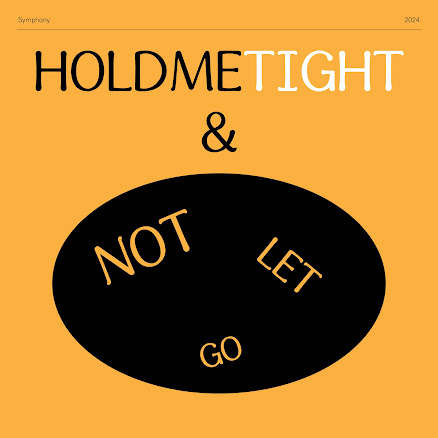
fig 5.1, Final Font 'Symphony' (21/7/2024)
Click here for the download link to my 'Symphony' font!
Font Presentation :
fig 5.7, Final Font and Font Presentation [PDF] (21/7/2024)
Font Application :
fig 5.8, Final Font Application (22/7/2024)
Video Backup Link (Google Drive) : Symphony Lyric Video
REFLECTION
Experience
Comparing to Typography in my semester 1, Advanced typography definitely felt more fun as the restrictions on some of the task are less. I feel as if this module also emphasized on our creativity with giving us this loose restrictions. While the tasks are definitely far more demanding compared to typography, I think the things we were designing and making definitely make up for it. This time around, there was also a combination of not only layout composition, but with an addition of colours too. I think seeing colour pop out in design is always so refreshing as it really brings a design to life. Overall throughout the 14 weeks, it was a pleasant experience as I have learned and created many interesting designs such as my typeface and logo. It has been an fun adventure and I hope to use typography in the future again.
Observation
Throughout the task, I have observed works from my senior and classmates and it has given me sparks of inspiration as some of them produce amazing designs. This has lead to sometimes redesigning things that I do not like in my work and making a comparison between them. I have also learned to look at more reference if I need them as sometimes I am very limited with ideas. The problem I face is I see looking at reference as a last ditch effort but when in reality, looking at inspiration allows me generate more ideas than if I could ever think it myself.
Findings
Findings
In advanced typography, they introduce colours in task 2 and it made me aware how crucial a good colour selection is to seal your design to be labeled as "good". While from a wide perspective, where colour is just another aspect of design, it is still an important aspect to consider especially when making something like a collateral in task 2. The colour of your identity needs to be good to attract people's attention. Having contrasting colours allow for a better colour scheme overall. I have also learned more about after effects during my animation with my logo and font application. This would certainly be handy for me in the future. Lastly, I found myself working on designs I sometimes don't like especially during task 1. Instead of trying to work on something that isn't working, I should instead start again with a clear mind so that I don't restrict myself on ideas.
My Other Advanced Typography Tasks :
My Other Advanced Typography Tasks :


Comments
Post a Comment