Typography | Final Compilation & Reflection
25.09.2023 - 07.01.2024 / Week 1 - Week 14
Yong Zhen Xing / 0359473
Typography / Bachelor of Design (Honours) in Creative Media / Taylor's University
Final Compilation & Reflection
TASK PROGRESSION
Task 1 : Exercises
Task 2 : Typographic Exploration & Communication
Task 3 : Type Design & Communication
SUBMISSIONS
Task 1 | Exercise 1 : Type Expression
25.09.2023 - 29.10.2023 | Week 1 - Week 5
25.09.2023 - 29.10.2023 | Week 1 - Week 5
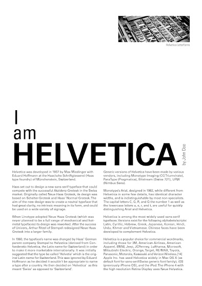
HEAD
Font/s: Univers LT Std
Type Size/s: 91 pt
Leading: 88
Paragraph spacing: 0
BODY
Font/s: Univers LT Std
Type Size/s: 9 pt
Leading: 11 pt
Paragraph spacing: 11 pt
Characters per-line: 60
Alignment: Allign Left
Columns: 2
Gutter: 5 mm
30.10.2023 - 12.11.2023 | Week 6 - Week 7
Task 3 | Type Design & Communication
13.11.2023 - 17.12.2023 | Week 8 - 12
fig 3.3, Final Type Construction "Curvy" (PDF) (15/12/2023)
fig 3.5, Final Typeface Poster (PDF) (15/12/2023)
REFLECTION
Experience
When I first started typography, I didn't really understood why was it a core subject but after going through 14 weeks of it, I finally understood the importance of typography. Initially before class even started, I always thought typography would just be arranging letters on an empty sheet. While we did do 2 tasks related to what I have just mentioned, the other 2 took me by surprise and made typography more interesting than I thought it would be. The first task about expressing actions through literally only using the letters from it was very fun and my favourite one amongst the rest as we needed to be creative in showing said action. There were also 2 similar task which tested out layout design and cover designing which weren't too bad. Finally the hardest one has to be the final task where we needed to design our own fonts. I found this last task the hardest as it heavily tested on our observation skills which I am surprisingly bad at. So many corrections were made in the process which made me thankful for the feedback session Mr.Vinod have each week. Even though it was short, I have learned from many mistakes I have made and noted on mistakes other students have done too. This definitely helped me in producing quality works. While this subject hasn't exactly been a smooth sailing journey, I am thankful I went through it as made me more observant and made me keep an open mind when designing. With the addition of the lecture videos, it has also expanded my knowledge on typography and made me really appreciate typography.
Observations
After the first few lecture videos that we needed to watch and document, it made me realize just how important typography is in everyday life. Typography is literally everywhere from print on boxes to our smartphone display. Ever since I took typography, whenever I would go out to a mall, I started just looking at store and restaurant letters/logos and just started analyzing them. It is always interesting and fun to see some of the creativity of stores typography whether it be hilariously bad or good. Throughout my task processes, I would also sometimes occasionally glance at other people's work to see their ideas so I could take inspiration from them (if any). Of course there were similar ones from some students but that is just the beauty of designing, sometimes we generate the same idea!
Findings
Before I started typography, I thought it would be just a simple subject to manage. However after going through 14 weeks of it, I have learned that typography is a not only a difficult subject but an extremely demanding in where you need to be observant and really know your design plan before only executing said plan. Going straight into designing without a plan would only lead you astray. This subject has also been technical in a way where you need to properly understand the fundamentals of what makes typography good. A good example of this would be task 2 where you need to know how and where you should be placing the passages to make it digestable by a reader. Surprisingly, typography class has also taught me some Illustrator shortcuts that I otherwise wouldn't have known. This would be certainly helpful in many upcoming classes in my degree. Overall, typography has taught me many important principles that I otherwise wouldn't know which would be very benificial to me when I enter into Typography II in the upcoming semesters and I can't wait what does the next one have in store for me.


Comments
Post a Comment