Typography | Task 2 : Typographic Exploration & Communication

30.10.2023 - 12.11.2023 / Week 6 - Week 7
Yong Zhen Xing / 0359473
Typography / Bachelor of Design (Honours) in Creative Media / Taylor's University
Task 2 | Typographic Exploration & Communication


Contents

1. Lectures

2. Instructions

    2.1 Sketching
    2.2 Digitizing
        2.21 Exploration 1
        2.22 Exploration 2
       
2.23 Exploration 3
       
2.24 Exploration 4
        
2.25 Exploration 5
       
2.26 Exploration 6
       
2.27 Exploration 7

    Final Outcome

3. Feedback

4. Reflection

5. Further Reading


LECTURES

All Online Lectures Notes

Week 6 :
Physical Class

For this class, we once again showed our Editorial Layout work in class and received feedback from Mr.Vinod. I took down some notes from other classmate's design as I struggled quite a bit with coming up with ideas for this task. Next, we continued with doing our work while Mr.Vinod circles around the class and check and gives feedback on our work. I was given feedback on the spot which helped with progressing through my work.


Week 7 :
Physical Class
In this class, Mr.Vinod first checked on some people's task 1 e-portfolio task and gave some feedback on each student he selects. After that we were to share our final editorial layout work where he also commented and gave feedback on people's work. We then discussed on the date of submission for task 2 which was the end of the week. Lastly, he gave a brief on our next task where he also demonstrated what is to be expected in the following week.


INSTRUCTIONS


Task 2 : Editorial Layout

Sketching

The 2nd task is all about understanding what makes a good layout while making it engaging to readers. First we were given 3 options for our editorial text. After reading through 3 different passages which are :

  1. The Role Of Bauhaus Thought On Modern Culture
  2. A Code To Build On And Live By
  3. Unite To Visualise A Better World

I have decided to choose the second as it's the most impactful one to me and as a student studying design, it is certainly relatable. First, I needed to make an engaging title, so I looked as past student's work to get inspiration. After looking as some examples, it was time to ideate. I took the word "code" and decided to expand the idea visually to see what I could come up with.

I narrowed down 4 most common type of code and sketch it out to try to get a rough idea on the design.

fig 1.1, Types of Code Sketch (27/10/2023)
 
 
Then I narrowed down again to 2 types of code to be use in the title design which are Morse Code and Barcode. Then I sketch out ideas after ideas while slowly improving on the design.
 
fig 1.2, Rough Idea Sketch (27/10/2023)
 
 
I also made a quick layout draft to see how it look with the positives and negatives space. The top of layout feels a bit empty, so in the second draft, I added a line with a barcode so emphasize on the meaning of the title more and also fill in the negative space.
 
fig 1.3, Layout Draft Sketch (27/10/2023)
 
 
Digitizing

I proceeded to digitize my sketch into InDesign. Below are the processes of it. First I divided the to 3 columns as that would be my initial text layout.
 
 fig 1.4, Design Digitization (28/10/2023)
 
 
Then I added text ensuring that the characters was about 45 or above and deciding whether the font matches with my title.

fig 1.5, Checking Character Length (28/10/2023)
 
 
Then I reposition the text to ensure the spacing for the next column are equal.
 
fig 1.6, Repositioning Text (28/10/2023)
 
 
 Then I begin performing my kerning and tracking on the text.
 
fig 1.7, Tracking and Kerning (28/10/2023)
 

I also bolded the text of each starting of a paragraph as it starts of with an impactful title.
 
fig 1.8, Bolding Keypoints (28/10/2023)


Finally I made the last paragraph Italics as it conveys a final strong message to readers.
 
fig 1.9, Changing final paragraph to Italics (28/10/2023)
 
 
Exploration 1 : 
The image below shows the completed layout alongside with the blocks form of the layout.
 

fig 1.10, Layout 1 (28/10/2023)


The Black blocks represents Title/Visual Elements
The Gray blocks represents Paragraph/Passage


fig 1.11, Layout 1 (Blocks) (28/10/2023)
 
 
And I didn't stop there, I also decided to do more explorations to see what designs I could come up with so that I don't restrict myself with 1 design.
 
Exploration 2 : 

fig 1.12, Layout 2 (29/10/2023)
 
fig 1.13, Layout 2 (Blocks) (29/10/2023)
 

Exploration 3 : 
 
fig 1.14, Layout 3 Initial plan (29/10/2023)
 
 
After a bit of more thinking, I thought of making the blacks visual on the box not coloured as the visual tension is too strong.
 
fig 1.15, Layout 3 (29/10/2023)

fig 1.16, Layout 3 (Blocks) (29/10/2023)

 
Rework :
After, receiving feedback about previous layouts, it was back to the drawing board for me because my layouts didn't really convey a message behind the text. So I first started rethinking the definition of the title.

Exploration 4 :
For the next exploration, I decided to go for a house theme since I could correlate the "build" and "live by" together. It was an attempt from taking roughly the same elements as the last layout and making in more simpler. I also showed Mr.Vinod this work but he said it was too "in your face" kind of design. With that, I moved on to a different layout but it was still an interesting layout to experiment with.

fig 2.1, Layout 4 (30/10/2023)

fig 2.2, Layout 4 (Blocks) (30/10/2023)
 

Exploration 5 :
In this layout, I looked at some from of a code and decided to use the dividing code as seen in the image below.
 
fig 2.3, Coding Reference (30/10/2023)

 
 Using that idea, I begin working on a layout where the title expands to the second page.

fig 2.4, Initial Layout for Layout 5 (30/10/2023)
 
 
I also decided to change the position of some parts of the text to help with the balancing of the negatives space. While I liked the concept of this layout, unfortunately it didn't really show the meaning behind the title/passage as said by Mr.Vinod.

fig 2.5, Layout 5 (30/10/2023)

fig 2.6, Layout 5 (Blocks) (30/10/2023)

 
Exploration 6 :
In this next layout, I experimented with the word code more. So for the title, I made it into a HTML or code based variation of it which looked like what the image shows below. For the passage of the text, I ensured it also lined up with the top and bottom part of the title.

fig 2.7, Rough Idea for Layout 6 (3/11/2023)
 

 I also ensured that the spacing on each part of the title is equal.
 
fig 2.8, Distancing the text equally (3/11/2023)
 
 
However with that, the page still felt a bit empty, so I added more code-like text in between each title with a lower colour value. I also made each line connect with each other for a bonus touch. Then I bolded the title to emphasize and so that readers could see it clearly.
 
fig 2.9, Adding more text and Bolding the Title (3/11/2023)
 
 
 I really liked how this design turned out!

fig 2.10, Layout 6 (3/11/2023)
 
fig 2.11, Layout 6 (Blocks) (3/11/2023)

 
Exploration 7 :
In the next layout, I decide to emphasize on the word "Build on". I looked for reference for the word build and found inspiration when I saw a Lego block. Then I begin making the title design based on the Lego blocks and making the layout.
 
fig 2.12, Lego Reference (5/11/2023)
 
fig 2.13, Layout 7 Idea (5/11/2023)


But the separation of the title felt as if it were missing something, so I needed to find a way to show that the letter "A" was being place. Then I remembered a simple but cool effect on Tetris where when you drop a piece fast, it creates this block placement effect. I decided to implement that on my title to show that the letter "A" is going to be place thus creating this form of "building".
 
fig 2.14, Falling Tetris Block Reference (5/11/2023)


I have also lowered the colour value to so that the impact I'm creating doesn't feel overwhelming.

fig 2.15, Adding a placing effect (5/11/2023)
 
 
This was another design that I was happy with!
 
fig 2.16, Layout 7 (5/11/2023)
 
fig 2.17, Layout 7 (Blocks) (4/11/2023)


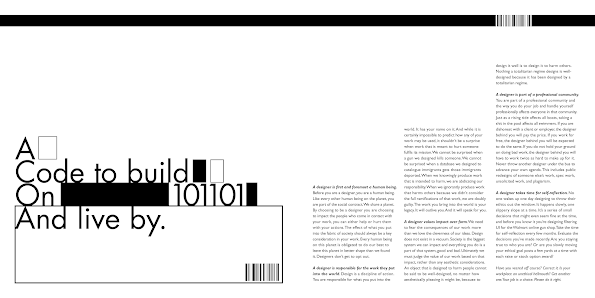
For the final submission, I've decided to choose layout/exploration 6 as I think it is a simple but effective layout. Below shows my paragraph spacing (¶) for layout 6.


fig 2.18, Pilcrow Paragraph Spacing (7/11/2023)


Final Outcome

fig 2.19, Final Editorial Layout (JPEG) (5/11/2023)
 
 
fig 2.20, Final Editorial Layout (PDF) (5/11/2023)

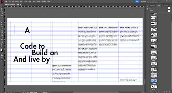
 fig 2.21, Final Editorial Layout - Grids (JPEG) (5/11/2023)
 

 fig 2.22, Final Editorial Layout - Grids (PDF) (5/11/2023)


FEEDBACK

Week 6
Task 2 :

Specific Feedback : The overall design is misleading in terms of expression and the barcode is not particularly helpful in terms of creating an impactful meaning to the readers.
General Feedback : When making the editorial layout, the word should have a meaningful impact on the readers to engage them more to reading. Another thing to keep in mind is that any sort of design/text alignment is key in making a successful layou
t.

Week 7
Task 2:
General Feedback : Ensure when you design a title, you do not just simply design for the fun of it, but you ask yourself ask yourself why. With that in mind, ensure the design relates to the title/passage as well.

E-Portfolio :
Specific Feedback : If I could, try to to reduce the amount of image, so that users browsing the website scroll less. Overall good presentation for the website.


REFLECTION

Experience
I personally found this assignment pretty difficult. I think my main issue is simply coming up with original ideas. Or maybe I think originality too much. But either way, this time I tried looking at more samples and reference and it helped me and in a way guided me to making more ideas. I guess the key takeaway is no one is truly original and there will always be some form of inspiration in the design field. Another thing to note is that even ideas that I thought were acceptable can't be winners but that's okay! That's what designing is all about, exploration until you come up with something more interesting!

Observations
After a feedback and sharing session with all the students, I have noticed that some student have roughly the same concept when it comes making the editorial layout, especially the Bauhaus passage. This tells me that coming up with ideas could often be similar to someone's else's and that is completely okay! As long as you can add your own twist or uniqueness to it.

Findings
One thing I noticed about myself is that I constantly focus on readability and guiding readers eye through the entire text. While considering that is not necessarily a bad thing, I think I focus on it so much to the point that I am limiting my creativity. So I decided to stop thinking about it and just let my idea flow and I think it helped a lot!


FURTHER READING


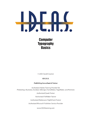
fig 3.1, Computer Typography Basics


This time I decided to read on another book that Mr.Vinod recommended which is Computer Typographic Basics as I would like to learn more on what makes a good computer Typography. After scrolling through the book a bit I also noticed that there's a lot of visual on the book which I liked. I also chose this book because each page is not particularly that long.
 
 
fig 3.2, Special Styles


I learned many aspects of computer typography that makes it tolerable for any users such as underlining, small caps/all caps, special purpose styles, text scaling and outline & shadows. Some interesting aspects such as underlining requires typographers to underline the text so that it doesn't touch any characters was such an odd choice but it makes sense. Other aspects like text scaling recommends typographers to select true condensed or extended font or alter the design so it doesn't use a fake font. I was confused. What is a fake font ? After a quick search turns out that a fake font is when a software attempts to emulate italic, bold, ordinals or small caps. I found that quite fascinating.

Comments

Popular posts from this blog

Advanced Typography | Task 1 : Typographic Systems & Type & Play

Interactive Design | Exercises

Typography | Task 3 : Type Design & Communication