Interactive Design | Exercises
Interactive Design || Bachelor of Design (Honours) in Creative Media / Taylor's University
Exercises || HTML Document Development & HTML, CSS Document Development, CSS Layout Mode
Contents
1. Lectures
2. Instructions
2.1 Web Analysis [Exercise 1]
2.11 Website 1 (Sculpting Harmony)
2.12 Website 2 (Loket Design)
2.2 Replicate a website [Exercise 2]
2.21 Website 1
2.22 Website 2
Final Outcomes
2.3 CSS Layout [Exercise 3]
Final Outcome
3. Feedback
4. Reflection
Lectures
Week 1 :
Physical Class
In our first class, we were first briefed on what softwares we will need. We also had to fill up a doc sheet that includes our blog for documentation purposes. Mr.Shamsul then briefed us on the Module Information Booklet (MIB) and gave us a rough understanding of what kind of work we will be doing. Lastly he briefed on our first exercise which was Web Analysis.
Online Lecture
In the first lecture, Mr.Shamsul first shared a video about Bad Door Designs (Click Here) which talks about the Norman Door Theory and why user experience (UX) is important in any type of design. Then he gave us a lecture about Usability.
Lecture 1 - Usability : Designing Products for User Satisfaction
Notes :
- Usability is when a user encounters an interface, they should be able to find their way around easily without needing much guidance.
- Some key principle of usability are Consistency, Simplicity, Visibility, Feedback and Error Prevention.
- Consistency means elements such as heading, footers, sidebars and navigation bars works harmoniously all across each other.
- Simplicity means the need to minimize numbers of steps in a process. Sometimes using symbols and terminology to make the interface as obvious as possible.
- Visibility means the more visible an element is, the more likely users will know about them and how to use them.
- Feedback means how well a site can communicate through interaction, making it both visible and understandable.
- Error Prevention involves alerting a user when they're making an error, with the intention to make it easy for them to do whatever it is they are doing without making a mistake.
Week 2 :
Physical Class
As mentioned by the lecturer in last week's class, we did a group activity this week. We needed to make a website prototype through drawing. It was interesting trying to design a "good" website in that time period and it was certainly fun looking other group's prototype.
Week 3 :
Physical Class
In this class, Mr.Shamsul first had a lecture about understanding website structure. He then shared some sites with specific website elements to demonstrate the goods and bad of some of the website design. Next, he gave up a brief for the next exercise which is Website Replication. He showed up how to screenshot the sites and also how to make up some elements such as the magnifying glass and the navigation button through illustrator.
Lecture 2 - Understanding Website Structure
- Websites are typically divided into : Header, Body, Footer.
- Headers is the top section of the page which usually contains the website's logo, navigation menu, and contact information.
- Body is the main page of the webpage that contains text, images, videos, and other multimedia elements.
- Footer is located at the bottom of a webpage and contains copyright information, links to important pages, and contact details.
- Labels need to be clear and concise so that it helps users move around the website. Dropdown menus are recommended for more complex sites.
Week 4 :
Physical Class
In this class, Mr.Shamsul has a lecture first about the web. The lecture essentially talks about the standardized web format, web structures and HTML. The lecture showed us examples of HTML tags which would be important for the upcoming class activity. In the class activity, we needed to create a HTML page that has our own info in it in notepad. We learned about heading size, paragraphing, and even adding a list. Afterwards, we needed to upload the website to Netlify.
- World Wide Web Consortium (W3C) is a central organization who is responsible and maintaining web standards. They have defined dozens of standards including standard markup languages such as HTML and CSS.
- Web standards are important for developers and visitors as development are simplified and all browser will display websites properly without rewrites.
- When a site is visited, the web server hosting that site could be anywhere in the world. In order to find the location of the web server, the browser will first connect to a Domain Name System (DNS) server.
- Use of headings and subheadings are important in terms of information hierarchy.
- The HTML code is made up of characters that live inside angled brackets '<>', these are called HTML elements. There should always be an opening and closing bracket. Exp: '<p>' followed by </p>".
- Attributes provide additional information about the contents of an element. They appear on the opening tag of the element and are made up of two parts: a name and a value, separated by an equals sign. (Example Below)<p lang=“eng-us”>Paragraph in English</p>
- <body> - Everything inside this element is shown inside the main browser.
- <title> - Contents shown normally in the top of the browser (Tab Bar).
- <head> - Used often before <body>. This contains information about the page.
- <h1> - Six levels of heading until <h6>.
- <p> - Used to create a paragraph.
- <b> - Used to bold words.
- <i> - Used to make words italic.
- <ol> - Used to create an ordered list.
- <li> - Each item in the list is placed between and opening and closing tag.
- <ul> - Used to create an unordered list.
- <a> - Creates link. (Exp : <a href=“http://www.imdb.com”>IMDB</a>)
Inserting Image
<img src=“image/foto.jpg” alt=“alternative text” title=“title of the image”/>
src - Specifies the path to the imagealt - Provides alternative text for the image (for accessibility)Title - This attribute provides tool tip of the image in the browser
Week 5 :
Physical Class
- Every HTML element can carry the ID attribute however it is important to note that no two elements have the same value for their ID attributes (otherwise the value is no longer unique).
- Giving an element a unique identity allows you to style it differently from any other instances of the same element on the page.
- Every HTML element can also carry a class attribute. This is to to identify several elements as being different from the other elements on the page.
- Class attribute on any element can share the same value or name.
- Block Elements : <h1>, <p>, <ul> and <li>
- Inline Elements : <b>, <i>, <em>, <a> and <img>
Physical Class
- CSS allows to create rules that specify how the content of an element should appear.
- A CSS rule contains 2 parts : a selector and a declaration.
Selector - Indicate which element the rule applies to.
Declaration - Indicate how the elements referred to the selector should be styled. - Declaration is broken down into 2 more parts : property and value.exp : font-family: Arial;
- 2 Ways to Employ CSS : Internal (through the same HTML file) and External (through another CSS style sheet)
Physical Class
In this class, we first had a lecture about CSS Selectors. Then Mr.Shamsul shared some examples on how to use CSS elements. Afterwards, we were to experiment with CSS elements and implement it to our HTML website, one of them being 'float'.
- CSS - Cascading Style Sheets
- Many CSS selectors such as :
- Universal Selector ('*' - selecting all elements on one page)
- Element Selector ('p' - targets HTML elements by their tag name)
- ID Selector ('#my-element' - targets element with a specific id attribute)
- Class Selector ('.my-class' - targets element with a specific class attribute)
- Descendant Selector ('.container a' - Selects an element that is a descendant of another element)
- Attribute Selector ('input[type=text"]' - Selects elements with a specific attribute value)
- Child Selector ('ul > li' selects elements that are direct children of another element)
- Pseudo-class Selector ('a:hover' selects elements based on their state or position in relation to other elements)
- Pseudo-element Selector ('p::first-line' selects parts of an element rather than the element itself)
- Adjacent Sibling Selector ('h1 + p' selects an element that is immediately preceded by a specified element)
- General Sibling Selector ('h1 ~ p ' selects all elements that are siblings of a specified element)
- Universal Selector ('*' - selecting all elements on one page)
- Reasoning to many selectors include : Specificity, Structure, Responsive Design, Stateful Interactions, Cross-Browser Compatibility, Ease of Maintenance, Accessibility.
Week 8 :
In this class we had a lecture about Box Model layout in CSS. After the lecture, Mr.Shamsul demonstrated how we would use the box model element. Then he gave us a simple code and asks us to add box elements in the code along with changing the typography, style and colour of the layout.
- Every element has a default display value.
- A box has 3 layers surrounding its content ; Padding, Border, Margin.
- Flexbox is for creating responsive and efficient web layouts as it manipulate elements' positioning and spacing within a container.
- Flex Container : The parent element with display: flex.
- Flex Items : The children of the flex container.
Instructions
Exercise 1 : Web Analysis
In this exercise, we are to review 2 websites from the links given. I needed to take note of its design, layout, content and functionality. I also needed to take note the strength and weaknesses of the websites and how they impact the user experience. Finally some recommendations (if any) for improvement of the website.
Selecting the 2 website :
When it comes to opening a website, I would usually search for its title and then only then click on the website I am trying to look for, but in this case for this exercise, it is a bit different. I am clicking on random award winning websites and seeing what they have to offer (in terms of user interface). So the 2 website I have chose for this exercise would be websites that I found really interesting and intuitive.
Website 1 : Sculpting Harmony (link here)
As for the performance of the website, I think it is really quick and responsive, some of the animation that plays goes by fast yet still very noticeable to the user is what makes interfaces like this feel smooth and elegant. The load time when entering the website for the first time is fairly quick and acceptable even when switching to my mobile data. For compatibility, the interface is well optimized with any devices whether it be a smartphone or a computer. Finally we reach the strength and weaknesses for the website. When it comes to strength of the website, pleasant user interface with it's strong eye-catching aesthetics comes to mind. However the layout of the site and font choice could be improved along with the very long page scroll. With that being said, it is definitely still a well-made and generally a good website.
Next, we move on to the functionality and usability on the website. The website has only 3 navigation button which makes it easy for users to filter by category. The website is also relatively easy to browse through for any users as it only has a few pages. There were only a few interactive elements in the website, most of them being hovering over a product/section for it to communicate with the user which is generally acceptable (fig 1.11). I have noticed compared to my the first selected website, that the navigation button in this site didn't show any form of interaction when hovering over it which is kind of a missed opportunity/oversight in my opinion. In terms of content, I think it is straightforward enough for a design studio. It doesn't need to show technical content and knowing it's coming from the design studio that made each product, its content is accurate. The content of the website is also well organized and tells its own story.
Exercise 2 : Replicate a website
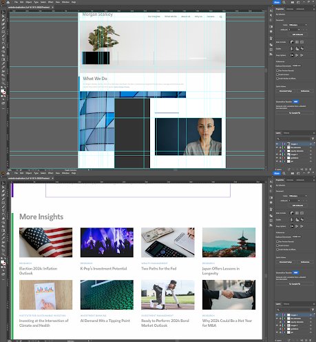
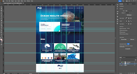
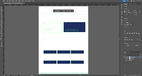
In this exercise, we needed to choose 2 websites from the links provided and replicate it in Illustrator. We needed to focus on the layout, type style, and colour style. The image however does not need to be the exact same from the site and can be replaced to a similar one.
First, I created guidelines on the imported screenshot.
fig 2.19, Final Website Replication 1 [PDF] (13/5/2024)
fig 2.20, Final Website Replication 2 [PDF] (13/5/2024)
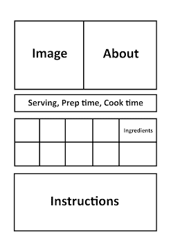
First, I decided to create a moodboard to get a rough idea on how a recipe card should look like.
Week 2 :
As long as you write following the information given in the google classroom, it is good.
Reflection
Exercise 1 - Web Analysis
For the first exercise, I found it enjoyable to be able to understand the flaws and strength of a website and what makes for a good user interface and experience. I have learned to do a detailed breakdown through 2 different devices to ensure that both ways were equal for the user interface and experience. Throughout this exercise, I have learned that responsiveness means everything when it comes to website design and the colours choices of the website should be pleasant to user's eyes. Exercise 1 overall teaches about understanding good UI/UX practices and I have learned to be critical in this aspect so I could use it to apply for my work.
Exercise 2 - Replicate a Website
In the second exercise, I didn't really enjoy doing this task. While it was straightforward enough, it feel quite tedious and annoying to do. However I do understand that this exercise is important in knowing about the layout of a website. Throughout the exercise, I have learned that newly introduced sections or elements most of the time always align with one of the elements before to have a balanced layout. Exercise 2 teaches about the importance of formatting in website design and I have learned to take this knowledge to use it for my future references.
Exercise 3 - CSS Layout
In the third exercise, I could say it was the one I didn't like the most. It is probably because I just generally hate coding. It's just errors after errors and looking for a way to get the website to the way I want. While getting the website to the way you want is really satisfying, the experience through creating it wasn't great at all. Throughout the exercise, I have learned many new different elements such as 'flex' through tutorials and websites which I then utilized in my recipe card to achieve the design I want. Exercise 3 teaches about HTML and CSS and when to use them when necessary. I have learned many new different elements that I can apply to future HTML/CSS works.
My Other Interactive Design Tasks :
Exercises (Current)
Project 1 : Prototype Design
Project 2 : Working Web Page


Comments
Post a Comment