Interactive Design | Project 1
13.5.2024 - 28.5.2024 || Week 4 - Week 6
Yong Zhen Xing || 0359473
Typography || Bachelor of Design (Honours) in Creative Media / Taylor's University
Project 1 | Prototype Design
Contents
1. Lectures
2. Instructions
1. References
2. Sketches
3. Process
Final Outcome
3. Reflection
Note : Lectures are all documented and links to my exercise page.
Instructions
Prototype Design - Digital Resume/CV
In this first project, needed to focus on creating a UI prototype for our Digital Resume/Curriculum Vitae (CV). We needed to use either Figma/Adobe XD and the UI design should focus on the layout, visual elements and user interactions.
1. References
Firstly, I needed to look up at CV examples to get some inspiration for my own. I found a few interesting websites CV and paid attention to the layout of the page as well as how it is document. I also had a moodboard for colour pallet to see which colour would be appropriate for my site.
Firstly, I needed to look up at CV examples to get some inspiration for my own. I found a few interesting websites CV and paid attention to the layout of the page as well as how it is document. I also had a moodboard for colour pallet to see which colour would be appropriate for my site.
fig 1.1, Initial References (20/5/2024)
Mr.Shamsul also shared some ideas about the CV (2 selected below). They seem to had a single page kind of formatting for the page, so that's the style I wanted to do for my resume. A single page scroll system.
2. Sketches
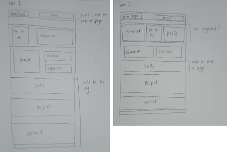
Next, I worked on the wireframe for the prototype. The sketches below show my ideas while also indicating my thoughts while making it. I ended up with idea 4 as my main structure.fig 2.1, Idea Sketch 1 (23/5/2024)
3. Process
Here comes the hard part! Designing and prototyping. First I followed my idea 4 structure and made the header with some simple elements. Then I tried out 2 of my chosen colour pallets from my initial references. While I like both, I think that the orange and blue is more suitable and contrast better with each other.
For the font, I went for Rum Raisin and Abel as I think that it works well with each other. A mix of stylized font and a simplistic font.
Chosen Colour :
After the colour was decided, I worked on making the structure which can be seen below.
Next I added all of my information for my resume including visual elements such as icons and my picture to enhance how the overall composition looks. For the icons, I ensured to use the same black and white colour scheme so that all the icons looks consistent (Except for the softwares).
fig 3.4, Added Drop Shadow (27/5/2024)
fig 3.5, Prototyping (27/5/2024)
fig 3.6, Adding Hover Effect (27/5/2024)
fig 3.7, Adding Hover and Click Effect (27/5/2024)
Here is how the text for my name look like when hovered over and clicked on.
fig 3.9, Adding Slider (27/5/2024)
fig 3.10, Hovering Interaction (27/5/2024)
Final Outcome :
Reflection
Experience
I had a fun time coming up the design and creating a prototype! It was honestly a fun experience learning how to use Figma and how to make interactions more lively in a website.
Observations
After looking through many CV examples, I have noticed that the format of a resume is mostly the same. What makes them stand out is the way they implement their own specialization into it. It gives them a stronger identity on what they do. I ensured to use this on my prototype design to give it a more "me" appearance while showing my type of specialization.
Findings
This project taught on the fundamentals of prototyping and trying to make an almost functioning website. Throughout the prototyping phase, I always ask myself "how could I improve this and make the website more exciting for users". This kind of mindset makes me think about what users tend to do in a website and what I could do to enhance their experience of using it.


Comments
Post a Comment