Information Design | Project 1 & 2
17.02.2025 - 04.03.2025 || Week 3 - Week 5
Yong Zhen Xing || 0359473
Information Design || Bachelor of Design (Honours) in Creative Media / Taylor's University
Project 1
Contents
1. Lectures
3. Feedback
4. Reflection
Project 1 & 2 : Animated Infographic Poster
For this project, we needed to redesign an infographic poster following good design practices as well as make minimal animation for the same poster.


 fig 1.3, Poster Layout Test 1 (25/2/2025)
 fig 1.4, Poster Layout Test 2 (25/2/2025)
 fig 1.5, Poster Layout Test 3 (25/2/2025)
 fig 1.6, Selected Poster (25/2/2025)

 fig 1.8, Using Simple Icons (27/2/2025)
 fig 1.9, Redrawing Logos (27/2/2025)
 fig 1.10, Infographic Design (27/2/2025)
 fig 2.1, Reformatting to 9:16 Ratio (2/3/2025)
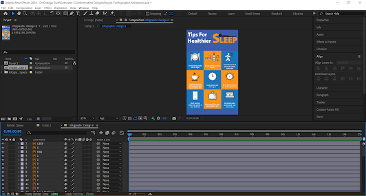 fig 2.2, Importing to After Effects (3/3/2025)
 fig 2.3, Animating Process (3/3/2025)
 fig 2.5, Final Infographic Design (3/3/2025)
ReflectionThis project has given me mixed feelings. Mainly because I did not enjoy the second part of the project, which was making a minimal animation. I used after effects to animate it but I needed to relearn it because I wasn't experience enough in the software. It was definitely a great addition to my Adobe CC knowledge however. Regarding the recreating design, it felt like a chore to do as we are limited on the content depending on the design you chose. However I do see the importance of redesigning something especially when working in that part of the industry. So overall, it was a beneficial and helpful project for designing.
Yong Zhen Xing || 0359473
Information Design || Bachelor of Design (Honours) in Creative Media / Taylor's University
Project 1
Contents
1. Lectures
3. Feedback
4. Reflection
Instructions
Project 1 & 2 : Animated Infographic Poster
For this project, we needed to redesign an infographic poster following good design practices as well as make minimal animation for the same poster.
Part 1 : Infographic Poster
First I needed to search the internet for an infographic poster and found these :
First I needed to search the internet for an infographic poster and found these :

fig 1.1, Selected Poster Design 1 (21/2/2025)
After a feedback session, I realized that we needed to choose a "bad" design to be redesigned. So I went searching the web again. Surprisingly, finding a "bad" design especially made intentionally is difficult. But I manage to find another 3 as seen below.

fig 1.2, Selected Poster Design 2 (25/2/2025)
Then I tried experimenting with different layouts for each of the poster.


I decided to go for the 1st one (Tips For Healthier Sleep) as it looked the most interesting to work on. I also decided to select on the first layout as it looked the most consistent. To not make it look messy, I took the 9 most important points. (The ones in red was not selected)
So then I begin designing the poster. For the banner title, I wanted to emphasize sleep, so I decided to add a person lying on the word "Sleep".
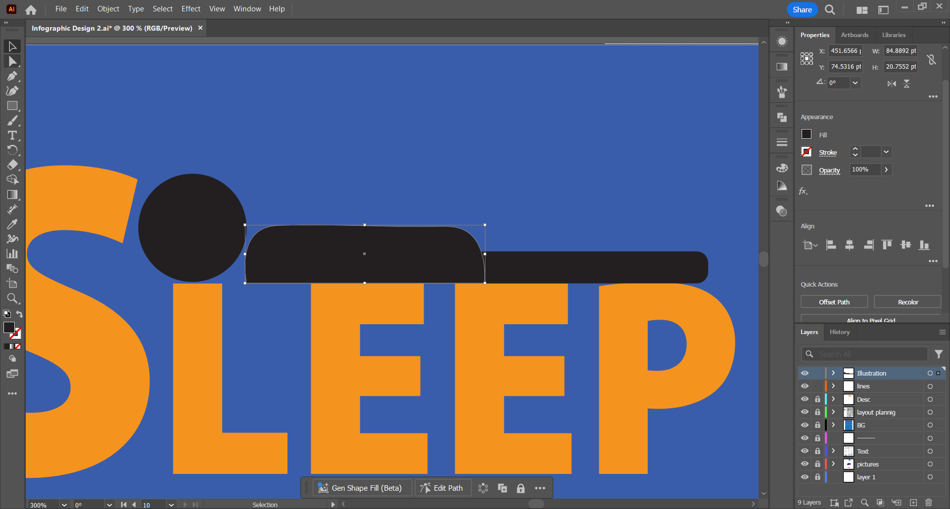
fig 1.7, Making Banner (26/2/2025)
Then I used Flaticon for each icons on the poster. I selected the most fitting and simple icons as it needed to fit with the simple illustration I added on the banner.

After that, I redraw all of the icons using the pen tool and making some minor changes on the artwork. The reason I redrew them is because it would be easier to adjust and animate later on. This will also help make all icons consistent on the poster.

Here is the outcome of the poster. I also removed the black and white lines as I think it looks cleaner.

Part 2 : Minimal Animated Infographic
Next part is the animating part. My plan for the looping animation is just to make each of the icons move accordingly. I would also add simple fading effects on the text as it goes through all of the point on the poster.
Since we needed to do in a 1080 x 1920 resolution, I needed to readjusted to that aspect ratio first. Once that was done, I then needed to import to After Effects and begin moving each elements accordingly.


Initially, there was supposed to be icons with fading effects, but while progressing I realized that when the video does loop, it will just seem random that the icons disappeared, so I decided to improvise and do some movement animations instead.

Here is the finished minimal animated infographic!
fig 2.4, Minimal Animated Infographic (3/3/2025)
Final Outcome :

fig 2.6, Final Minimal Animated Infographic Design (3/3/2025)
fig 2.7, Final Minimal Animated Infographic Design [Youtube] (3/3/2025)
Feedback
Do not use good artwork/infographic as your base, as in the end you'll be comparing the before and after of the produced work. Your artwork should be better than the chosen artwork.
Reflection


Comments
Post a Comment